Crypto UX: Why Normal People Still Hate Wallets
Crypto wallets still scare normal users with seed phrases, gas, wrong-chain risk, address poisoning, and irreversible transfers.
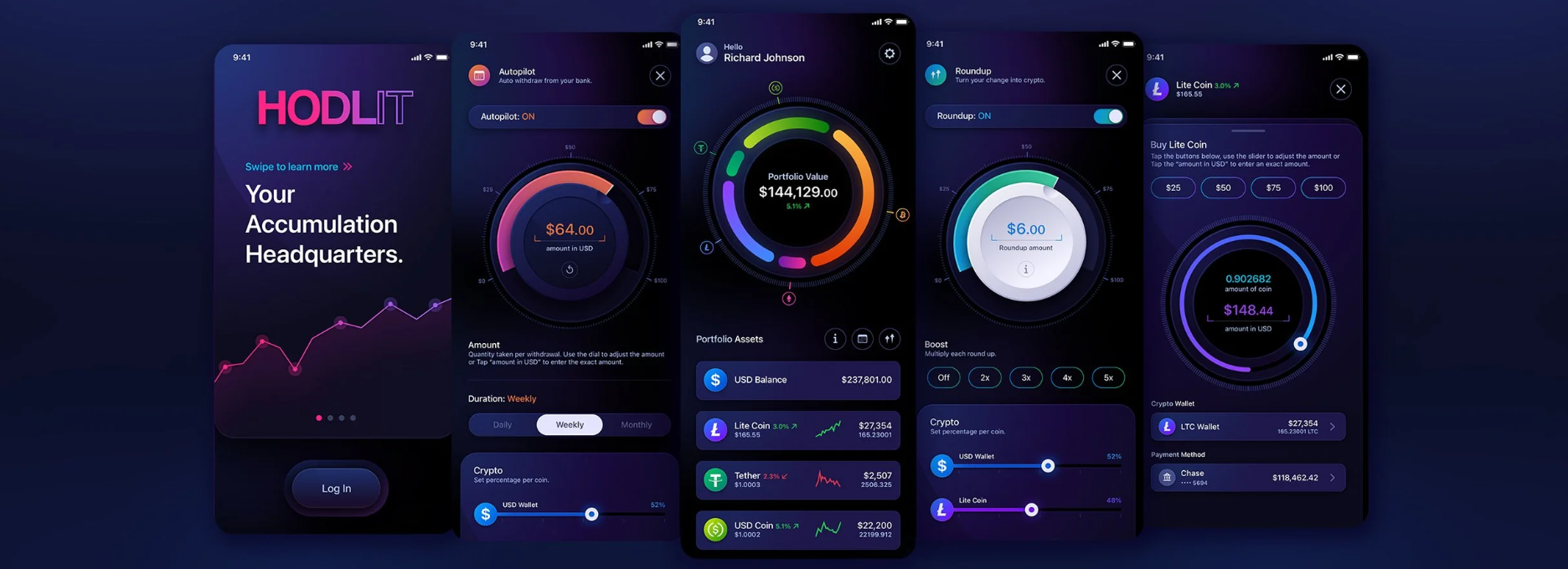
People complain about every interface. This is one of the universal laws of the internet. Move one button and someone will start yelling that it broke their life. Show a security prompt and someone will accuse you of wanting to steal their money. Hide a scary menu and someone will insist that the reason civilization still exists is because of that scary menu.
So let’s acknowledge the obvious – that users do not particularly like design. Crypto is not an exception to this rule, but a crypto interface asks regular users to perform irreversible financial operations within an application that sometimes seems to have been developed by someone who views fear as a feature.
Historical Precedent
Online banking was also scary at the dawn of the internet. Not that it didn’t have real security threats, but a user who was comfortable writing checks and withdrawing cash at an ATM was asked to type their bank password in a beige box on their home PC which also had three suspicious toolbars. Early online bank interfaces were clunky, slow, poorly designed, and littered with legalese: Users had to battle through screens of text in order to send a single bill payment. One wrong move and you’d be wire transferring your mortgage to Nigeria.
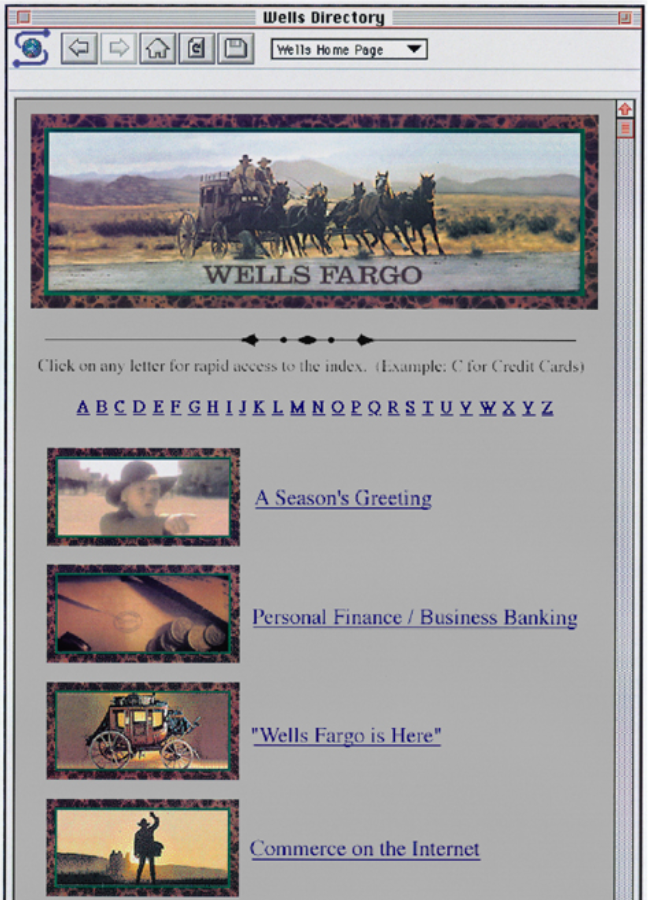
The early days of the internet were also scary. Making a purchase online was an ordeal for the average pizzeria customer. Inserting your credit card details into a website seemed like trusting a stranger with your life. Clicking “submit” and waiting for the page to refresh was something akin to Russian roulette. But it all became routine after years of repeated purchases, chargebacks, customer service disputes, fraud protection lawsuits, and overall normalization of the process.
Modern day online banking is still not as nice as it needs to be, but it has improved drastically since those early days. The language is simpler, the buttons are bolder, and you always know who to call if something goes wrong. The bank always has your back, or at least the illusion of it: You are not infinitely liable for mistakes in the system, and someone is always there to refund you or dispute a fraudulent charge. The overall experience is still not perfect, but at least your six-figure mortgage is not going to become a five-figure mystery donation to a Nigerian prince every time you make an error.
Forgiveness Layer
This ability to recover from user error is what I call the forgiveness layer.
It is one of those things that are really obvious in hindsight but surprisingly difficult to achieve before someone else does it first. Any transaction can be disputed, any bank transfer cancelled, any confused action undone. A login can be blocked, a lost card reported, a fraudulent charge countered. It is all tedious and far from perfect, but at least the option is always available to the user: The bank system always remembers that it is not the guardian of financial safety, but rather the gatekeeper to the safety provided by the physical world.
That is why crypto wallet UX has so much to learn from online banking: Banking apps may have their issues, but they understand one essential philosophy – that the average user will make mistakes, and the system should be designed to recover from them. Crypto has to build its own forgiveness layer.
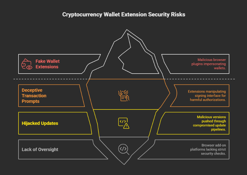
Crypto natives often dismiss the early interface design of online banking as naive, inappropriate or just outright laughable. And yet, crypto wallets of today are in many ways reminiscent of those very same early 2000s interfaces. New users are asked to type in their secret recovery words, choose the correct blockchain, understand the difference between approve and stake, bridge their assets, verify transactions, sign messages, avoid phishing, address poisoning, wrong-chain deposits and other nastiness. And, just like early online banking, it all comes with a heavy helping of warnings and stern notices. It is not a tutorial, it is more like a flight manual given to a passenger whose pilot just fainted.
Wallet as Cockpit
A new crypto user feels like he is in the cockpit of an Airbus 380. There are buttons everywhere: Approve, sign, switch, bridge, stake, pay, claim, unlock, add, execute… The wallet interface serves as a reminder that every button press has consequences. Some actions are simple: Pay someone on Chain X with this token on this network. Others, like interacting with a smart contract, are even more complicated. Everything is possible but nothing is intuitive – the new user is constantly battling the doubt that he might have made the wrong choice at any step of the way.
Crypto natives will tell you that this is normal – that you quickly get used to the language of crypto and start signing transactions without thinking. You memorize that a message signature is rarely a payment, that an approve action for a token contract is often more dangerous than a simple transfer, that a USDT contract on Tron is not the same network as an Ethereum USDT, that an exchange deposit address has to be checked several times before sending the funds – but the average crypto user is still expected to learn all of this the hard way. The new user is also quickly reminded that he does not really understand what most of these actions mean.
One particular bad UX detail that has survived to this day is the importance of choosing the right blockchain network. When you see USDT in your wallet, you might think of it as USDT, but crypto will remind you that it can be ERC-20, TRC-20, BEP-20 or any other standard. It can be on a different settlement chain, use a different explorer, have a different set of dangers associated with it. The name might be the same, the numbers sometimes identical, but the action of sending it anywhere always carries the risk of a one-way adventure to another universe with no return ticket. Regular finance also has multiple rails but most users are never aware of the differences between them, let alone asked to choose between them before paying for groceries.
This is, of course, where the online bank comparison fails spectacularly: If you accidentally send money to the wrong person with a bank, it may be a problem. But there is usually someone to blame and someone to refund. If a user accidentally sends crypto to the wrong address, the blockchain space will take no responsibility for the lost funds: The address exists, the transaction is valid, the funds are gone. Even if the wallet interface warned the user multiple times, these warnings did not help in the end.
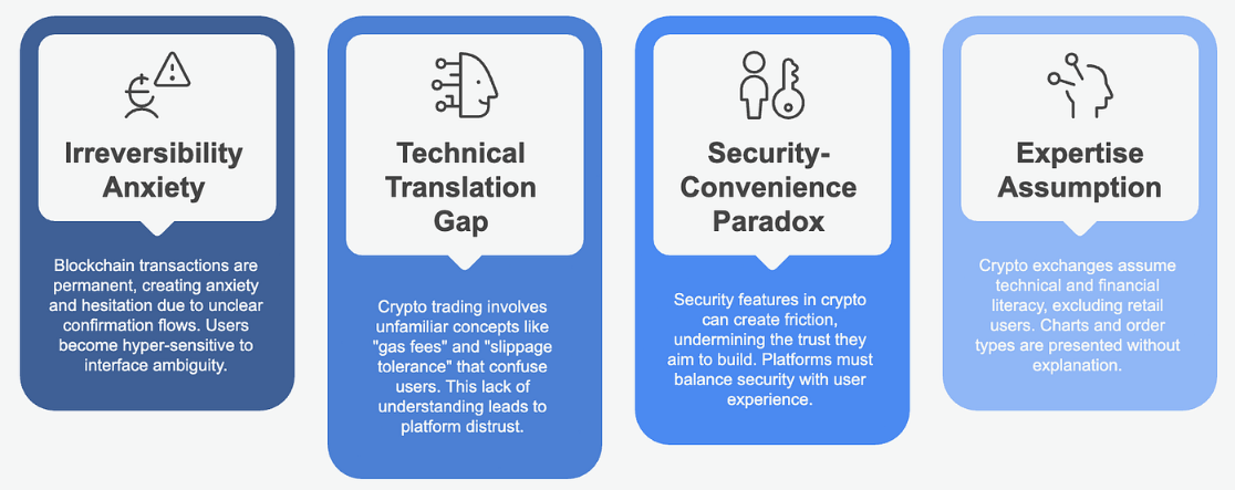
Crypto UX thus has to design around the permanence of its operations: Every action has to be understood by the user in full before being executed. It is the reason why crypto wallets are so afraid of a ‘confirmation’ button and often demand more context from the user. It is the reason why a transaction preview is so important, why a security alert feels like an existential crisis, and why a new user often asks himself “what am I signing here anyway?”
TRON Example Case: Resource Layer as UX Malfunction
TRON is a good example of an ecosystem that is great in many ways but has one crippling UX weakness. The popularity of TRON-based stablecoins such as USDT is undeniable, but a newcomer to the TRON network is immediately confronted with the mysterious concepts of TRON Energy and Bandwidth. The TRON documentation is not wrong to describe them as resources, but a user who wants to send a simple payment to another address often finds himself in an endless debate with the wallet about how much Energy he needs for that particular transaction.
Bandwidth is consumed when a transaction is sent, and Energy is burned when a contract is executed. The amount of required Energy varies wildly depending on the destination address and can be anywhere from 65000 to 130000 for a simple token transfer. For the unprepared user, it is similar to buying a train ticket and being asked if he brought enough coal.
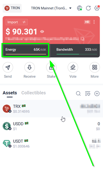
A newcomer to TRON who wants to send someone a few dollars in the local currency will have to spend time understanding what Energy is, set up a Gas Limit, choose the right Network for his needs, memorize the receiving address, make sure that the TRON address is valid and that his TRON wallet is not expired in any way. None of this is wrong, and most of it is completely logical to anyone who understands how the system works. But no one really expects a new user to understand why he needs to know all this in order to send a few tokens to his friend.
Newbie Nervousness
This is also where most scams and phishing attempts originate: a dishonest actor can send a few ‘dust’ transactions to the user’s wallet using an address that looks exactly like the one the user is trying to send money to. This way, the beginning of one address is the same as the end of the other. One day, the user tries to send money to one of the addresses and is robbed of his funds because the transaction went to the ‘spoof’ address instead. In many ways it is a replay of the phishing 404 page scam: The interface itself teaches the user to make the mistake by only displaying part of the address.
It is surprising how much crypto has learned from the early days of online security. Modern wallets such as MetaMask have built-in scam protection: if the user tries to send funds to a suspicious address, he will be warned about his intentions. Similarly, block explorers now label suspicious transactions as potential scams and hide irrelevant on-chain data such as zero-value transfers to make the history less confusing. Security companies monitor the blockchain for signs of address poisoning and report hundreds of thousands of suspicious addresses with dust transactions to wallets. Similarly, the TRON network has its own particular issue with address spoofing that manifests in TRX transactions with minuscule values. But none of these measures fix the underlying cause of the problem – the UX warning about a suspicious address is still a warning, and the address itself is valid. The scammer only used the design conventions of the interface to perpetrate his fraud.
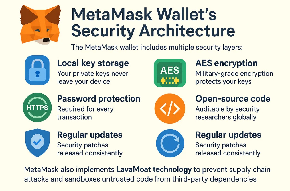
Phishing scams work in a similar way: An attacker tricks the user into signing a transaction that appears harmless but secretly sends funds to another wallet. Fake tokens can appear in the wallet after a suspicious website visit, and a phishing site can look exactly like an official crypto site. A transaction preview will display some scary smart contract code right before executing the fraudulent transfer, and a wallet can ask the user to approve unlimited token spending, simply because some dapps require that level of permission by default. Users are constantly warned not to be deceived by interfaces, but at the end of the day the bad actor only follows the same design conventions that are used by legitimate platforms. The scam is effective because the interface rarely tells the user what it actually does – it only asks the user to confirm certain clearly stated actions.
This is the real UX problem of self custody: A product has to assume that the user knows what he is doing, but then constantly warns him that he may not know what he is doing.
Crypto Wallet Vibecoding
It is also reasonable to ask what exactly makes a good UX in crypto. What does the industry perceive as good, and where is the opportunity for improvement?
It is highly unlikely that the average Apple designer looks at crypto and imagines ways to make DeFi safer for the grandmothers who want to buy yield-generating stablecoins. Crypto has brilliant minds, great security reviews and some amazing products, but the development culture was not built around everyday users. It was built around developers who knew what they were doing and did not consider themselves to be the target audience for their own products.
This is an important distinction because it defines the entire relationship between the user and the interface. An attentive UI/UX designer will build a nice product for everyday users, but he will also realize that the people who will really benefit from his product are the ones who already know what they are doing. A developer who launches a confusing wallet with an airdrop right after launch will gain popularity among his peers, but it will take him years to fix the UX flaws and win over the general audience. The market fit for a niche product is easily found, but it often comes at the expense of general usability.
Some crypto products are literally vibecoded, because there is no real audience for them besides the devs who launch them. A small team can throw together an interface with rough edges and confusing language simply because they understand the space better than anyone else and therefore do not see the problem. This is why many projects resemble each other so strongly: They are built by people who only know one interface, copy its conventions blindly and treat their own product as superior simply because they are not confused by it.
An interesting effect of this development culture is that the dev-to-dev interface becomes the standard for everyone else. The people who are truly proficient in crypto – the developers – rarely interact with confusing interfaces. They use their own tools that other developers find intuitive. The same tools, in turn, are often confusing to the newcomer who has to learn how to use them. The dev environment thus serves as a type of clubhouse: The dev tools are only useful to devs, but the devs treat them as their own.

The crypto dev culture sometimes boasts about this dynamic. Crypto is a club, and the club has its secrets. A newcomer who does not understand the language is not welcome. A user who lost money is being punished for his lack of skills. A wallet interface that scares the user is teaching him a lesson. There is some truth to this philosophy, because self custody really does require responsibility from the user. But it falls apart when applied to the general audience: A technology that wants to gain mainstream adoption cannot shame its users for being ignorant.
A similar argument can be made from a business perspective: confusing interfaces do not promote engagement. If a user fully understands the cost of each transaction, he will probably be less willing to make it. The product will suffer, or it will have to change to accommodate this level of engagement. Most bad interfaces are not intentionally evil, but they all contain at least some elements of bad business design.
In summary, crypto UX looks like it was vibecoded by an early 2000s enterprise software designer. It understands the value of warnings and permission prompts, but it rarely remembers that these prompts are only useful if the user actually knows what he is doing. It treats its audience as if they all graduated from the cryptobro academy of finance and do not require explanations.
This approach has its advantages and disadvantages, but it has allowed crypto to develop a unique identity that reflects the values of the space. Users are responsible for their own funds, and the interface serves mostly as a reminder of this responsibility. This is why new users are often turned off by crypto: They are not used to a financial product that acts like a prosecuting attorney every time they attempt a transaction.
This culture is likely to change as crypto continues to evolve and grow. Some positive steps have already been made, such as the introduction of account abstraction, but it will take time for the industry to realize that its end-user products need a different approach to UX design.
Better Wallets Are Coming
Crypto wallets are not what they used to be. The good news is that the industry itself realizes this, and meaningful improvements are being made. Wallets are now smarter about warnings, explorers are better at labeling, transaction previews are often more descriptive – hardware wallets are generally nicer to use, mobile interfaces are lighter, exchanges are sometimes friendly. All in all, it is much easier to be a crypto user than it was ten or even five years ago.
The biggest change is happening in the space of account abstraction and smart wallets: The promise of account abstraction is to make crypto wallets similar to what users are already familiar with, without sacrificing the security and permissionless nature of the space. An account abstraction layer such as ERC-4337 empowers a wide range of use cases including social recovery, spending limits, gas sponsorship, batched transactions and more. Users can sign transactions with a secure device such as Face ID without dealing with private keys directly. Smart accounts can delegate certain wallet operations to a bundler who handles gas payments on behalf of the account.
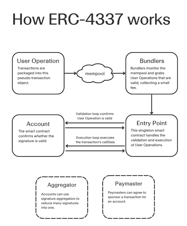
These innovations represent a fundamental shift in the relationship between the user and the wallet: Where once the security of self-custody was achieved through the complexity of private key management, smart accounts are empowering users by giving them more control of their session keys and transaction permissions. Everyone from Coinbase to MetaMask is working toward this vision of a smarter wallet that does not require users to understand how elliptic curves work in order to pay rent.
An embedded wallet is yet another step towards this goal: The wallet exists primarily as a feature within another application, providing a seamless and intuitive experience similar to a native app. Users typically sign in with their email or social media account, and gas costs are either sponsored by the app or hidden behind a familiar ‘pay’ interface. Embedded wallets are not without their challenges, but they represent a real opportunity to change the way most users interact with crypto.
Conclusion
Crypto’s long road to normalization has just begun. The industry has come a long way in its efforts to improve the end-user experience, and many promising ideas are now being explored. These ideas often take their inspiration from the familiar world of traditional finance and realize that crypto, for all its technical brilliance, still needs to earn the trust of the everyday user. It is no longer enough to rely on clever smart contracts and powerful decentralized infrastructures. Attention must be paid to the details of UX design if crypto is to fulfill its promise of financial sovereignty for all.
Crypto UX is complicated, multifaceted and intimidating, but it should not be confusing. Usability will always be a challenge where crypto meets the everyday user, but it should not be a requirement for self custody. A self-custody wallet may not be as intuitive as a centralized exchange, but it should still prioritize simplicity and avoid unnecessary complexity as much as possible. New users are not supposed to earn their place in crypto by being initiated into the mysteries of decentralized finance. They are supposed to be empowered by an inclusive and accessible financial technology that meets them where they are.
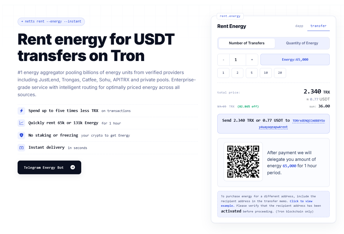
Some aspects of this transformation are more important than others. In the TRON ecosystem, one of the key areas of improvement is the management of TRON Energy. New users are often intimidated by the concept of Energy and its role in the TRON network. Netts.io helps to alleviate this issue by providing tools to purchase TRON Energy, discover affordable TRON Energy sources, and transfer TRON stablecoins in a more energy-efficient manner. By enabling users to rent 65,000 or 131,000 TRON Energy for a short period of time instead of burning TRX directly, TRON users can make their initial energy experiences less intimidating and therefore more welcoming to new users.